 |
D-Lib Magazine
March/April 2013
Volume 19, Number 3/4
Table of Contents
A Mobile Interface for DSpace
Elías Tzoc
Miami University Libraries
tzoce@miamioh.edu
doi:10.1045/march2013-tzoc
Printer-friendly Version
Abstract
Academic libraries were among the first adopters of mobile websites in universities, but much of the early development was focused exclusively on traditional library content such as the library's homepage, catalog, contact information, etc. As libraries continue to work on new technology developments, a mobile interface for their institutional repositories can be a good new way to reach out to faculty and other interested parties. Miami University's Scholarly Commons runs on DSpace as part of a shared infrastructure administered by OhioLINK. DSpace is used at academic institutions, research and resource centers, museums, national libraries, and government and commercial organizations. With over a thousand installations in more than 90 countries, DSpace is the most widely used open source repository platform by any measure. The steady popularity of DSpace suggests that a lot of institutions will benefit from an out-of-the-box mobile interface. This article describes the development and implementation of the first mobile interface developed for DSpace using the jQuery Mobile Framework.
Keywords: Mobile Interface, DSpace, Institutional Repositories, jQuery Mobile
I. Introduction
Academic Libraries were among the early adopters of mobile interfaces in universities, although most of those mobile developments were focused exclusively on limited types of services such as a library's homepage, catalog, contact information, etc. In the article "On the Move with the Mobile Web: Libraries and Mobile Technologies", the author provided a summary of major university libraries' mobile initiatives and stated, "Libraries are mastering the mobile web to bring patrons a new set of services — services that their users are coming to expect from their communities and content providers" (Kroski, 2008). In 2010, Library Journal conducted a Mobile Library Survey where 483 respondents indicated that "44% of academic libraries and 34% of public libraries currently offer some type of mobile services to their customers; two out of five libraries of all types, academic and public, report plans to 'go mobile' in the near future." (Thomas, 2010). Another study published in 2010 presented the type of services available on 39 Association of Research Libraries' mobile sites (Aldrich, 2010). In that publication, the author also compared and contrasted the results with the literature identifying what mobile web users desired and provided an initial benchmark for comparisons with other institutions.
Undoubtedly, the development of library services and sites tailored to mobile users has gained momentum in the last four years and for many it may seem to have reached a level of maturity; however, libraries' content goes beyond what we now see in current library mobile sites. A recent publication on mobile sites for other types of library content is the article "Developing Mobile Access to Digital Collections" in which the authors presented the "findings from in-depth case studies of four selected institutions and university libraries" that offer mobile services for their digital collections or cultural heritage collections (Mitchell & Suchy, 2012). As libraries continue to work on new technology developments, a mobile interface for their institutional repositories can be a good new way to reach out to faculty and other parties interested in scholarly communication. In this article, we describe the development and implementation of the first mobile interface for DSpace — an open source application used worldwide for institutional repositories.
II. Why a mobile theme for DSpace?
DSpace was developed by the Massachusetts Institute of Technology (MIT) Libraries and the Hewlett-Packard Labs; it was first released in 2002 and has become one of the most widely used platforms for open access digital repositories at academic institutions, research and resource centers, national libraries, and government and commercial organizations. As of August 31, 2012 the "Usage of Open Access Repository Software" report in the Directory of Open Access Repositories (OpenDOAR) indicates that 891 (40.6%) of those registered repositories are using DSpace. On the same date, the DSpace Registry reported 1,333 live DSpace instances. Some of the benefits of using DSpace for scholarly content include: built-in workflows for submitting data in any file format, international standards for metadata, access to an active community of developers, availability of the XMLUI framework for creating customizable front-ends, and a growing list of service providers. One of the most recent and significant projects using DSpace is the World Bank Open Knowledge Repository, which was released in April 2012. As for the topic of mobile sites for institutional repositories in general, there seems to be little to nothing written or done about it. In the section 'Possible Research Directions' of the article "Institutional Repositories: Features, Architecture, Design and Implementation Technologies", the authors briefly discussed mobile access, saying "Of all the eleven (11) IR platforms reviewed, only Greenstone supports access via mobile devices." (Adewumi & Ikhu-Omoregbe, 2011).
The steady popularity of DSpace in the last few years suggests that a lot of institutions will benefit from an out-of-the-box mobile interface. One of the dilemmas in providing mobile access seems to be deciding whether to create an app for every major mobile device in the market, or create a mobile-optimized website. For us and many others, the best option was to develop a mobile-optimized website that can work on a wide range of mobile devices. The jQuery Mobile (jQM) framework is definitely one of the best tools currently available for this approach. With jQM, developers can rest assured that their sites will work in low-capability phones as well as in high-end touch smartphones. The use of HTML5 standards in jQM allows developers and web designers to create a single robust and highly branded website that will work on all popular smartphone, tablet, and desktop platforms.
Miami University Libraries' institutional repository, Scholarly Commons, is currently running on DSpace 1.6 and it is one of many instances hosted at the Ohio Library and Information Network (OhioLINK) in a shared infrastructure. Since the deployment of the first website in 2008, the Digital Initiatives team has been using the XMLUI framework, initially developed by the Texas A&M University Libraries, to implement several front-end customizations. In early 2012, with the previous experience in creating DSpace themes, and the need for a mobile interface for Scholarly Commons along with all the features available in the jQM Framework, we decided to propose the creation of a mobile theme for DSpace. A theme is a modular interface layer that allows developers to create customized web interfaces for a DSpace repository, community or collection. A quick check of the DSpace-tech list archive confirmed that a mobile theme was added to the list of new features in September 2011, but after that, there was nothing else done. With this in mind and in the hope that our work can help some of the organizations already using DSpace, we decided to add the mobile theme as a goal for the summer of 2012.
III. Development and Implementation
The real adventure started in late May 2012 with a message to the DSpace-tech listserv with a couple of basic questions regarding the XMLUI webapp. The replies provided useful suggestions for setting up the required files for a mobile theme experiment. The next step included two key activities:
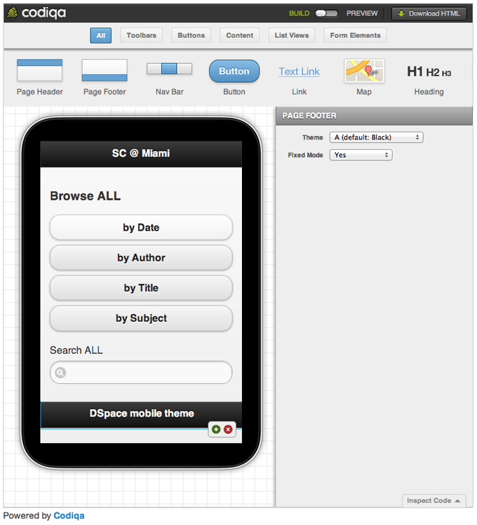
- Creating a wireframe for the mobile interface. Figure 1 below illustrates the first design created using the drag-and-drop UI builder available on the jQM's homepage. Even in this early part of the project it was important to stick to basic rules, such as data entry on mobile devices should be minimized, and the design should be kept simple and clean. Because of those rules and since the target audience for the mobile theme are end-users and not DSpace administrators, we decided to remove the entire "ds-options" sidebar, which contains all of the administrative functions in DSpace.
- Researching for mobile "best practices". The first document we reviewed was "library/mobile: Tips on Designing and Developing Mobile Web Sites" (Griggs, Bridges & Gascho, 2009) where the authors provide key design and development strategies for building mobile websites. Reading and becoming familiar with the wealth of information on the jQM's "Demos & Documentation" page was also important. It was very useful to watch the "Mobile Web Design & Development Fundamentals" tutorial by Joe Marini, especially the chapters on Mobile Web Development Guidelines, Setting Up a Development Environment, and Putting It All into Practice.
 Figure 1: Wireframe for DSpace Mobile Theme
In June, we incorporated proper HTML5 elements as specified in the Mobile page structure template in the default miami.xsl file. After completing the structure for the front page, the next step was to create a mobile theme using the ThemeRoller site. At this point, we had a decent working mobile-optimized site, but we also noticed that even with the new page structure and the generated CSS files, several DSpace elements that are dynamically generated and context sensitive (e.g. collection list or view) were still displaying in a non-mobile style. A first fix was to create a new JavaScript file and use the .html() property to modify the HTML on the fly; however, this solution in jQM requires a manual page refresh and we cannot expect users to refresh a page every time they move to a new page. A Plan B was to create a new CSS file and add all the required CSS tweaks to give the entire site a mobile look-and-feel.
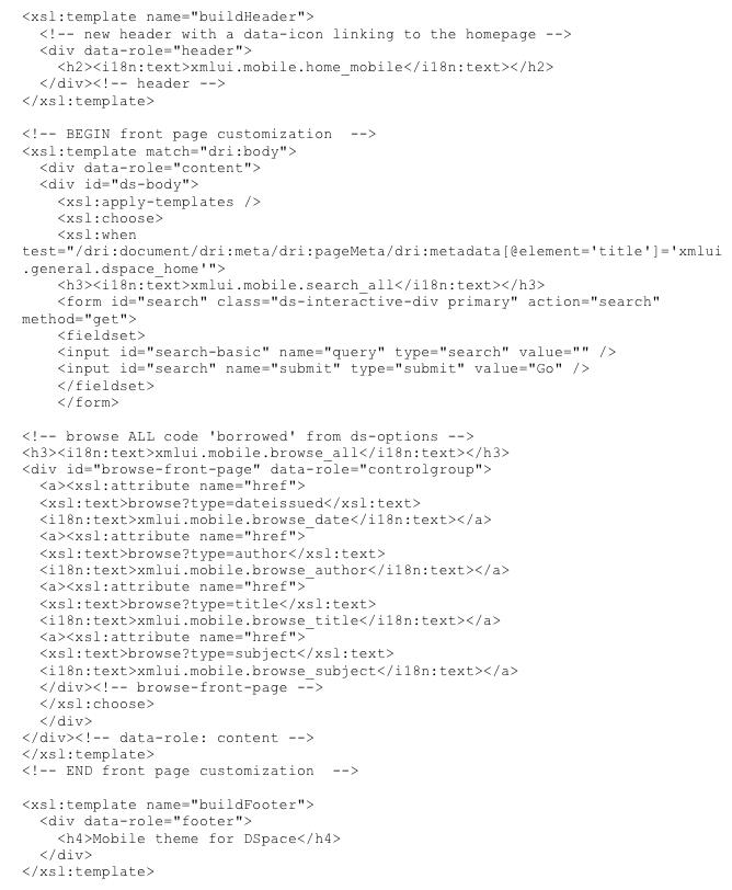
Below is the basic template for the front page.

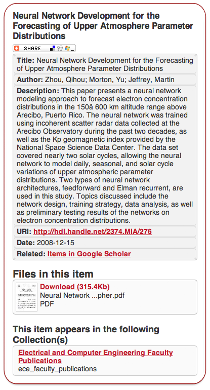
Another section of the mobile.xsl file that required a major customization was the template for displaying individual items. Figure 2 illustrates an example of a typical item page and five main elements: title, share button, metadata with six fields (Title, Author/s, Description/Abstract, URL, Date, and Related items in Google Scholar), thumbnail and link for downloading files, and a link back to the item's collection or community.
In mid July, we had a mobile theme running on a second copy of the XMLUI webapp on a DSpace 1.6 installation. We later learned this is probably not the best way to do this, but back then this was the only way we got it to work and it allowed us to continue testing and tweaking some CSS, XML, XSL, and JS files. Another lesson learned during this phase of the project was to always devote enough time to testing your site on different devices or in every major device emulator available. For us, the Opera Mobile Emulator and the Android SDK were very useful in testing and adjusting the site to small screen sizes (even 320×240); the iOS Simulator worked just fine, but the real headache was with the Windows Phone Emulator because it simply did not work and kept displaying a "not loading" error. After considerable time was spent researching the error, we learned that it was an HTML element without a closing tag. We spent the rest of July adjusting and testing the mobile theme in every device and emulator available.
 Figure 2: Example of an Item's Page
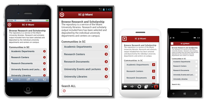
In early August, we ran some final tests and we believed it was time to share the link with others and start collecting external feedback. We posted a comment and a link to a first zip file on the DuraSpace JIRA ticket page. At the same time, we wanted to test the new interface on an OhioLINK machine and this was when we learned that duplicating the XMLUI webapp was neither effective nor sustainable, especially in a shared infrastructure. James Russell, OhioLINK developer, came up with a solution, which required a second domain name and it turned out to be a great and robust solution for us. Figure 3 illustrates four screenshots of the new DSpace mobile interface as viewed on four different emulators. On September 10th, we were pleased to actually see it up and running on a production machine. To access the site, visit http://sc.lib.muohio.edu/. If your device is not detected as mobile, try the mobile site http://mobile.sc.lib.muohio.edu/.
 Figure 3: DSpace Mobile Site on iOS, Android, Opera and Windows Phone Emulators
To see a larger version, more detailed version of Figure 3, click here.
For anyone interested in installing and further customizing the DSpace mobile theme, a copy of the released version is available. A working copy is available on the DSpace site on GitHub. It was added to DSpace version 3.0, released in November 2012. Details about the theme file structure and an installation guide is available in the Appendix at the end of this article.
IV. Conclusions
Overall, this summer project turned out to be quite exciting and positive, as it allowed us to implement a mobile interface for our Scholarly Commons site and perhaps most importantly, the project was added to the core code of DSpace 3.0, which will potentially benefit many DSpace users. As noted earlier, this first mobile theme is exclusively focused on end-users of the DSpace repository whose main activities are likely to be searching and browsing for scholarly content. Among the future activities that can help to further develop the mobile theme for DSpace are: a) developing a usability test of the current theme; b) development of mobile-friendly structures for complex pages such as the "Advanced Search" page; and c) evaluating the feasibility of a mobile interface for DSpace administrators, which may incorporate the SWORD (Simple Web-service Offering Repository Deposit) protocol to easily ingest items into a repository.
Finally, as we worked on this mobile project, we learned how hard it can be to be compatible with the majority of the mobile devices and screen sizes currently on the market. In fact, many web designers and developers are quickly getting to the point where they are unable to keep up with the rapidly growing number of new devices and screen sizes. They argue that for many websites, creating a website version for each resolution and new device would be impractical. The discussion seems to suggest that the solution relies on the concept of "Responsive Web Design", which is an approach to web design where the site is created to provide an optimal user experience regardless of the end-user' device. Thus, an interesting question for the DSpace community to consider is would it be feasible to explore the possibilities of responsive web design for DSpace.
Acknowledgements
The author would like to thank James Russell, OhioLINK developer, for helping with the implementation of a second domain for the mobile theme; and Ivan Masár, Member of the DSpace Committer team, for providing technical assistance in adding the code to the DSpace 3.0 release.
References
[1] Adewumi, A. O. & Ikhu-Omoregbe, N. A. (2011). Institutional Repositories: Features, Architecture, Design and Implementation Technologies. Journal of Computing, Vol. 2 No. 8.
[2] Aldrich, A. W. (2010). Universities and libraries move to the mobile web. EDUCAUSE Quarterly, Vol. 33 No.2.
[3] Griggs, K., Bridges, L.M., & Gascho, H. (2009). library/mobile: Tips on Designing and Developing Mobile Web Sites. Code4Lib Journal, Issue 8.
[4] Kroski, E. (2008). On the Move with the Mobile Web: Libraries and Mobile Technologies. Library Technology Reports — American Library Association.
[5] Mitchell, C. & Suchy, D. (2012) Developing Mobile Access to Digital Collections. D-Lib Magazine Vol. 18, No. 1/2. http://dx.doi.org/10.1045/january2012-mitchell
[6] Thomas, C. L. (2010). Gone mobile? (Mobile Libraries Survey 2010). Library Journal, Issue 17.
Appendix
The mobile theme file structure is:
+-- mobile
|   +-- lib
|   |   +-- cookies.js
|   |   +-- detectmobile.js
|   |   +-- images
|   |   |   +-- ajax-loader.gif
|   |   |   +-- default-thumbnail.png
|   |   |   +-- icons-18-black.png
|   |   |   +-- icons-18-white.png
|   |   |   +-- icons-36-black.png
|   |   |   +-- icons-36-white.png
|   |   +-- m-tweaks.css
|   |   +-- sc-mobile.css
|   |   +-- sc-mobile.min.css
|   |   +-- mobile.xsl
|   |   +-- sitemap.xmap
|   |   +-- themes.xmap
|   +-- readme.txt
The installation process is as follows:
- Get a new domain name that is an alias of the existing domain name for your DSpace installation, e.g. if your current domain is yoursite.edu your new domain name might be mobile.yoursite.edu. (These instructions assume that the new domain name starts with 'mobile.' If it is something else, you will need to make a change in step 4.)
- Copy the mobile theme folder into your XMLUI theme folder, e.g., ../dspace/webapps/xmlui/themes/.
- Copy the messages_mobile.xml file into the default i18n folder, e.g., ../dspace/webapps/xmlui/i18n. This is a workaround that guarantees that the mobile theme only reads this file as it contains new/short labels for the mobile interface.
- Add a call for the detectmobile.js and cookies.js file in the header of your current main theme.xsl file. It should look like this example:
<script type="text/javascript" sc="/themes/mobile/lib/detectmobile.js">& #160;</script>
<script type="text/javascript" sc="/themes/mobile/lib/cookies.js">& #160;</script>
In this file, you can also add a "View mobile site" link in the footer section, which will allow users to view the full site on their mobile devices. The cookies.js file saves this preference but it is erased when the session is closed.
- Open the detectmobile.js file and enter your new mobile domain at the end of the function call e.g. mobile.yoursite.edu. If you choose a different domain name or theme name other than "mobile" make sure to update the settings in the sitemap.xmap
- In mobile.xml, find the link "View full website" and replace the references to yoursite.edu with the domain name for your main site. Check for lines 255-257.
- Replace or edit the themes.xmap file located in your default theme folder, e.g., ../dspace/webapps/xmlui/themes/. The code for setting up the properties for the domain is in lines 32-37. This will need to be changed if the domain name for your mobile site starts with something other than 'mobile.'
- Restart Tomcat. You should be able to see the mobile theme in action; to change the look-and-feel, go to http://jquerymobile.com/themeroller/ and either create your own files or import/upgrade the uncompressed sc-mobile.css file.
About the Author
 |
Elías Tzoc, originally from Guatemala, assists the head of the Center for Digital Scholarship to provide Miami University scholars with the facilities, services, and expertise to support the creation and use of digital scholarship in all its forms. His current/recent work includes: developing and prototyping web interfaces for digital projects using CONTENTdm, DSpace, WordPress, OJS, and Omeka; researching for new access points and mobile apps for digital library programs using the jQuery mobile framework; researching and publishing on technical issues and open source applications for libraries; writing and co-leading grant-funded projects; and developing web plug-ins using PHP, HTML5, XSLT, CSS, and jQuery.
|
|