D-Lib Magazine
March/April 2015
Volume 21, Number 3/4
Table of Contents
Tools for Discovering and Archiving the Mobile Web
Frank McCown, Monica Yarbrough and Keith Enlow
Harding University
{fmccown, mwallers, kenlow}@harding.edu
DOI: 10.1045/march2015-mccown
Printer-friendly Version
Abstract
Many websites are adapting their content for users who are accessing the Web using smartphones and tablets. The growth of this Mobile Web has required web archivists to change their practices in order to collect this ephemeral web content. We have created a tool called MobileFinder which can be used to automatically detect mobile pages when given the URL of a desktop web page. We used this tool in an experiment to gauge what techniques popular websites are currently using to expose mobile content, and we incorporated the tool into Heritrix to demonstrate its usefulness to the web archiving community.
Introduction
When Apple introduced the iPhone in 2007, its touch screen interface revolutionized the smartphone industry and set a new standard which other phone manufactures would soon emulate. They also sparked a revolution within with the Mobile Web: the iPhone web browser was able to render web pages created with HTML, CSS, and JavaScript, making older markup languages like CHTML, iHTML, and WML unnecessary to reach smartphone users. Other smartphone manufacturers followed suit and produced equally sophisticated web browsers. This set off a flurry of activity as web developers started to build web pages that would fit smaller screens and were tuned to users on the go.
The growth of the Mobile Web has prompted web archivists to archive both the desktop version and mobile version of websites. However, there are a number of ways that a website might expose their mobile pages, and modern web archiving tools like Heritrix are not currently able to automatically discover mobile content or focus their crawling on mobile content without manual configuration.
We have created a tool to automatically discover mobile web pages when given a seed URL. We adapted our tool to be used as a web service and made minimal code changes to Heritrix to use the tool to automatically discover mobile websites. We also performed an experiment using our web service to discover mobile sites and looked for markers that should indicate that mobile content is available to a web crawler. We share our findings crawling the Mobile Web and the tools we built in hopes that other web archivists will benefit from our experiences.
Mobile Publication Methods
There are three primary techniques used by websites to deliver mobile pages. We refer to these techniques collectively as mobile publication methods:
- Using responsive web design (RWD) techniques that deliver the same content to both desktop and mobile devices
- Dynamically serving different HTML and CSS to mobile devices using the same URL
- Using different URLs to send out desktop or mobile pages
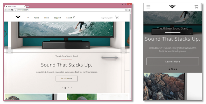
When sites use responsive web design (RWD), the desktop and mobile devices receive the same HTML contents (Marcotte, 2010). The CSS contains media queries that apply different rules for styling the page so a desktop's page may look very different than a mobile's page. An example is shown in Figure 1 where accessing www.vizio.com returns the same content to desktops (left) as it does mobile devices. However, the CSS radically transforms the content to fit the smaller viewport of the mobile device (right).

Figure 1: Accessing www.vizio.com on a desktop (left) and mobile device (right). RWD is used to render the page differently depending on the device's viewport size.
RWD is ideal for web archivists because archiving the mobile pages for a site means archiving the desktop pages since they are one and the same. However, the crawler needs to be aware that RWD is being used so it does not waste resources making additional requests with mobile user-agents.
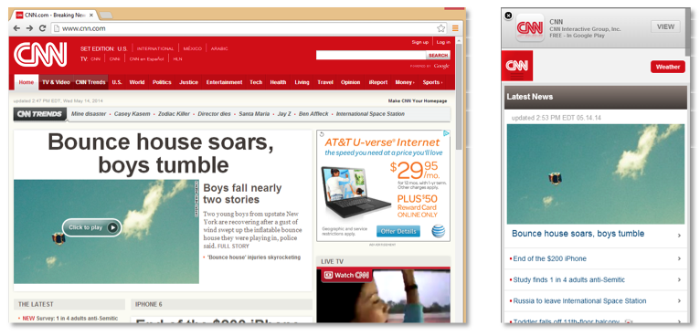
Some websites use the second publication method and dynamically serve different content depending on the user-agent in the HTTP request. An example is shown in Figure 2 where a desktop browser (left) accessing www.cnn.com is served radically different HTML and CSS than when a mobile browser (right) requests the same URL. In this case, an archive wishing to capture both the desktop and mobile versions of the website must configure their web crawler to first crawl with a mobile user-agent and then crawl it again with a desktop user-agent. The tools used to view the archived pages should also be made aware that the pages crawled with a mobile user-agent are designed specifically for a mobile browser (Kelly, Brunelle, Weigle, & Nelson, 2013).

Figure 2: Accessing www.cnn.com on a desktop (left) and mobile device (right). The same URL produces different responses depending on the user agent.
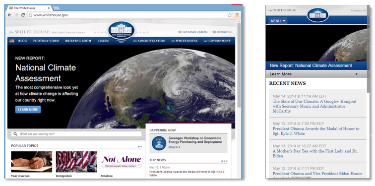
The third publication method used to deliver mobile pages employs client-side or server-side redirection. That is, a request for a desktop version of a web page using a user-agent for a mobile device is automatically redirected by the client or the server to the mobile version of the page. Redirection most often takes place by the server returning a 302 HTTP status, but the client can also redirect using JavaScript. On the left side of Figure 3, a request to www.whitehouse.gov by a desktop browser results in the desktop version of the website. But if a mobile browser requests the same URL, the browser is redirected to m.whitehouse.gov as shown on the right side of Figure 3.

Figure 3: Accessing www.whitehouse.gov on a desktop (left) and m.whitehouse.gov on a mobile device (right). The site employs server-side redirection to serve the correct content to mobile devices.
Crawling Mobile Pages
All three mobile publication methods (RWD, different content from the same URL, and different URLs) are currently in widespread use. Regardless of which method is used, most web masters want their desktop and mobile websites to be easily discovered and indexed by web search engines like Google, so they must take care to ensure their sites are crawlable. This also benefits web archivists since they typically use web crawling as the primary method to archive websites.
Google has led the way in providing guidelines on how desktop and mobile websites should be configured to properly handle requests from web crawlers (Google, 2014). For RWD sites, there is little for a webmaster to do; Google scans each page it crawls for media queries to determine if RWD techniques are being used.
When sites dynamically serve different HTML on the same URL to mobile user-agents (mobile publication method 2), Google recommends that web servers use the "Vary: User-Agent" HTTP header to give a hint to web crawlers that different content will be served when the server gets requests from different user-agents. The crawler will then need to make separate requests using standard desktop user-agent strings and user-agents for common mobile devices.
When separate URLs are used to serve desktop-only and mobile-only content (publication method 3), Google recommends that webmasters add annotations in the desktop and mobile pages to help their crawler discover corresponding URLs for the other platform. Desktop pages are supposed to have <link rel="alternate"> tags that point to the corresponding mobile URLs, and the mobile pages are to use <link rel="canonical"> tags that point to the corresponding desktop URL.
Web archiving tools like Heritrix are not currently configured to look for these markers in order to automatically discover and crawl mobile pages. Web archivists instead must know a priori which of the mobile publication methods is being used so they can properly configure a web crawler to crawl a mobile site. This can be challenging when there are a large number of sites to be crawled, and the archivist doesn't know if the sites have mobile-specific pages or not. Ideally the crawler should be able to discover automatically if a website contains mobile pages, and to use the most efficient method to crawl them.
We now discuss our work in creating a web service which allows web crawlers to be modified to crawl mobile sites with a minimum of code changes.
MobileFinder Web Service
We first developed software to automatically detect mobile web pages when given the root URL of a website (Schnieder & McCown, 2013). The software would send multiple HTTP requests with a variety of desktop and mobile user-agents and examine the responses to determine if a website was serving mobile pages and if so, which mobile publication method the website was using.
This software was later enhanced and incorporated into a REST-based web service called MobileFinder that would allow a client to discover information about a given seed URL. For example, if MobileFinder were queried with the URL www.whitehouse.gov, the service would return the XML in Figure 4 which indicates that the URL m.whitehouse.gov should be used to access the mobile page and that this determination was due to the fact that the URL was discovered with a server-side redirect. The user-agent string used by MobileFinder to discover the mobile page is also provided in the response; the user-agent can be supplied by the client, if so desired, when making the initial service request.
<mobileFinder>
<url>http://www.whitehouse.gov/</url>
<mobileUrl>http://m.whitehouse.gov/</mobileUrl>
<reason>
<code>300</code>
<message>Server redirect</message>
</reason>
<useragent>Mozilla/5.0 (Android; Linux armv7l; rv:9.0) Gecko/20111216 Firefox/9.0 Fennec/9.0</useragent>
<timeAccessed>2014-04-20 15:23:42</timeAccessed>
</mobileFinder>
Figure 4: XML response from MobileFinder web service
MobileFinder caches its responses for a configurable amount of time so future requests for a particular URL don't have to be re-computed. The HTTP responses are stored, as well as snapshots of the fully rendered web pages, using PhantomJS; this makes it easier for us to ensure MobileFinder is working properly.
Experiment
We devised an experiment using MobileFinder to give us an idea as to how popular each of the three mobile publication methods were. We randomly selected 1,000 URLs from Alexa's top ranked 1M websites (Alexa's top 1,000,000 websites, 2014). Each of these URLs points to the root page of a website that receives a significant amount of web traffic as recorded by Alexa. In April 2014, we fed each of the 1,000 URLs to MobileFinder and recorded the responses.
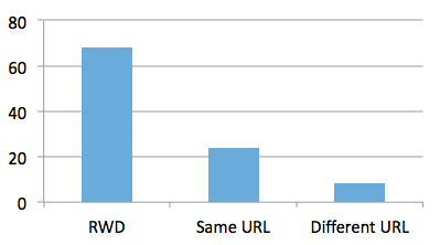
MobileFinder concluded that 62% of the randomly selected URLs had a mobile-specific root page. Figure 5 shows the three mobile publication methods used by the random selection of Alexa URLs. The majority of mobile pages (68%) used RWD techniques (method 1). Twenty-four percent of mobile pages were served via the same URL to a mobile user agent (method 2), and only 8% of mobile pages were served from a different URL (method 3).

Figure 5: Mobile publication methods used to discover mobile pages from randomly selected 1,000 URLs.
We also wanted to know what percentage of these websites were conforming to Google's guidelines by offering "markers" to crawlers to help them crawl mobile content. In other words, we wanted to know if a website:
- used the "Vary: User-Agent" HTTP header when dynamically serving different HTML on the same URL to mobile user-agents (mobile publication method 2),
- or used <link rel="alternate"> and <link rel="canonical"> tags when using separate URLs to serve desktop-only and mobile-only content (publication method 3).
Of the 240 URLs that used method 2, only 27% of them also used the Vary header. For the 80 sites using method 3, none of them used the <link> tag to point to the corresponding mobile or desktop URL. Although our sample is relatively small, this finding suggests that most websites are not following Google's guidelines, so archiving crawlers should not yet rely on these markers to discover mobile content.
Heritrix Mobile
Heritrix is one of the premier web crawlers used by web archivists to crawl websites, but it does not have the built-in capability to discover mobile web pages. Integrating the logic behind MobileFinder into Heritrix was an expensive proposition, so we instead made minimal modifications to Heritrix so it could use the MobileFinder web service. We provided new configuration options so the Heritrix user could seed the crawler with the standard desktop URLs and indicate they wanted the mobile versions crawled as well as the desktop versions.
When the modified Heritrix was configured to crawl mobile sites, it would take a seed URL and send it to MobileFinder to see if there were additional seeds that should be added to the initial seed list. It also used the user-agent string provided by MobileFinder or provided in the configuration options to crawl the mobile pages.
We ran a limited experiment feeding Heritrix the URLs of 10 popular websites that were known to have mobile pages, and Heritrix was successfully able to crawl both the desktop and mobile sites. The code modifications served as a proof-of-concept that an existing web crawler with no specialized logic for crawling the mobile web could be modified to use our web service to provide mobile web crawling capabilities.
Conclusion
As the mobile web grows, web archivists will need tools to automate the discovery of this content so it can be captured. We have created MobileFinder to aid archivists in this endeavor, and the MobileFinder web service code has been made publically available to others who would like to incorporate it into their web crawling tools (MobileFinder, n.d.). In the small experiment we ran, we found that most mobile pages are created using responsive design techniques which benefits web archivists because it requires no additional crawling to capture both the desktop and mobile versions of a website. This technique is likely to increase in popularity in the future (Summerfield, 2013). But the experiment also showed that some websites are serving mobile content at the same URL to mobile agents or using different URLs to serve mobile content; although these last two methods are not as popular as RWD, a web archiving tool needs to be aware of when these methods are being used so it doesn't miss finding mobile content.
Acknowledgements
This research was supported by the National Science Foundation (IIS 1008492).
References
[1] Alexa's top 1,000,000 websites. (2014).
[2] Google. (2014, Feb 11). Building Smartphone-Optimized Websites.
[3] Kelly, M., Brunelle, J. F., Weigle, M. C., & Nelson, M. L. (2013, Nov/Dec). A Method for Identifying Personalized Representations in Web Archives. D-Lib Magazine. http://doi.org/10.1045/november2013-kelly
[4] Marcotte, E. (2010, May 25). Responsive Web Design. A List Apart.
[5] MobileFinder. (n.d.).
[6] Schnieder, R., & McCown, F. (2013). "First steps in archiving the mobile web: automated discovery of mobile websites". Proceedings of the 13th ACM/IEEE-CS joint conference on Digital libraries (pp. 53-56). New York: ACM.
[7] Summerfield, L. (2013, November 25). 6 Undeniable Reasons Why The Future of Web Design is Responsive. HubSpot.
About the Authors
 |
Frank McCown is an associate professor of Computer Science at Harding University. He completed his Ph.D. at Old Dominion University where he focused on digital preservation of websites using the publicly available Web infrastructure (search engines and caches). His research interests include digital preservation, web crawling, and web search engines.
|
 |
Monica Yarbrough is a software engineer at Thales-Raytheon Systems. She graduated in 2014 from Harding University with a double major in Computer Science and Mathematics.
|
 |
Keith Enlow graduated from Harding University with a BS in Computer Engineering in 2014. He now works in Little Rock, AR as a software engineer for ABC Financial Services.
|
|